Why Does Some Art Stop You in Your Tracks? How to Channel This Magic in Your Own Creative Work
I was twelve years old the first time I walked into the Philadelphia Museum of Art.
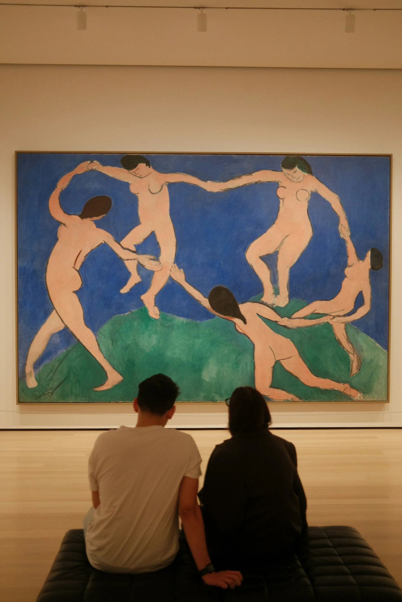
It was field trip day, and I remember climbing those famous Rocky steps with our class, not really knowing what to expect inside. And then—wham. I went quiet, taking in each work like it was speaking right to me. A Henri Matisse painting stopped me dead in my tracks, bright patterns and simple bold lines - Matisse created this almost childlike energy on a flat canvas - it was a world I wanted to step into. This French artist, born in 1869, working across an entire ocean and a century before I existed, somehow reached right through the canvas and grabbed something in me. I was mesmerized by this "real art," though I couldn't have told you why. I just knew it worked. It pulled me in. I couldn’t look away.
How did he do that? What invisible force made that painting—and not the one hanging next to it—draw me in? How does art made by someone we'll never meet, from a time and place completely different from our own, connect with something in our soul?
(And here's a wild connection I only recently discovered: Matisse's great-grandson is a potter! He runs East Fork Pottery and doesn't emphasize the family connection—his work stands on its own. But how perfect is that? The creative impulse traveling through generations, from painting to clay.)
This week, we're diving into the "Understand" phase of creativity—where we become detectives of our own work. We're going to break down exactly why some pieces grab your attention while you breeze right past others. Here's what's useful about dissecting work you love: once you see the keys that bring a piece to life, you can apply those same principles to your own art. No mystery, just tools. And like all good art lessons, it might even help you see other parts of your life more clearly.
Switch from Maker to Viewer:
Where does your eye travel? What world is the artist showing you? How do they use space, color, tone?
Why This Actually Matters (Spoiler: It's Not About Being Critical)
There is a risk in the editing phase of creativity. You might be thinking "Great, another way to overthink my art and kill all the joy." But stick with me here.
Understanding what makes art effective isn't about becoming some harsh critic of your own work. It's about giving yourself a roadmap. When you can identify why something isn't working, you're not stuck anymore. You're empowered. You can fix it. You can learn from it. And most importantly, you can make your next piece even stronger.
The brain craves visual harmony and interest—it's literally wired to seek out certain patterns, contrasts, and compositions. More than half of the brain's cortex is devoted to processing visual information! That’s crazy. But it shows how important those first visual impressions are - instantly creating an emotional response to a piece of artwork. When we understand these principles, we're not limiting our creativity; we're speaking the language that our viewer's brain already understands.
The "Does This Piece Actually Work?" Checklist
Alright, let's get practical. Here's what I look for when I'm evaluating my own work or studying pieces I admire:
1. Color: Are You Using It Intentionally?
Color is emotional. It's visceral. And it's usually the first thing people notice about your work. Ask yourself:
Do your colors support the mood you're trying to create?
Is there a dominant color that anchors the piece?
Are you using temperature (warm vs. cool) to create depth or draw the eye?
I gravitate towards bright color in my work - but over time I’m learning how to more intentionally feature the key colors by considering the surrounding color choices. A bunch of random bright colors create confusion, and the eye doesn’t know where to look, or what’s important.
2. Tone: Can I Actually See What's Happening?
Here's where my vision science background really kicks in. Tone (the lightness and darkness of your colors) is what creates form and depth. Squint at your piece. Can you still see the structure? If everything blurs into one mid-tone mess, you've got a problem.
The trick: your piece needs a good range from light to dark. Not everywhere—but enough to create visual interest and guide the eye through the composition. Tone really helps show the viewer what is important - which leads us into composition.
3. Composition: Where Am I Supposed to Look?
Think of composition as the GPS for your viewer's eye. You're literally directing traffic on your canvas or sculpture.
Key questions:
Is there a clear focal point, or is everything competing for attention?
Does the eye have somewhere to rest, or is it exhausting to look at?
Are you using the rule of thirds, or intentionally breaking it? Your eyes, and brain, need a framework. There needs to be enough order that the brain can make sense of it.
I love working with the dynamic tension between chaos and order in my abstract pieces. But even chaos needs structure, or it's just... well, a mess. This is why you might see an abstract piece and think, I could totally do that! And yet the masters have such a handle on composition that even though it seems to be simple forms, it keeps pulling your back in, satisfying your brain’s need to solve a problem, and (I hate this phrase - but) it gives your visual processing brain “something to chew on.”
4. Contrast: Is There Enough Drama?
Contrast is your best friend. Light against dark. Rough against smooth. Large shapes against small details. Without contrast, there's no zing. No pop. Your piece just lays there like a sad pancake.
In my ceramic work, I'll often combine highly textured carved sections with smooth, glazed areas. That contrast makes both elements stronger. The texture feels more tactile, the smooth parts feel more serene.
Here's where my vision background gets really nerdy and excited: our eyes are literally built to detect contrast. The cells in our retina don't actually respond to uniform light—they respond to edges, to differences, to where things change. So when you create strong contrast in your work, you're working with human biology. You're giving the viewer's visual system exactly what it craves.
5. The Intangibles: Does It Have Soul?
This is the hardest one to pin down, but you know it when you see it. Does the piece have:
Energy? Is there movement, even if it's a still life?
Authenticity? Can you feel that someone actually cared while making this?
Risk? Did the artist push themselves, or play it safe?
Some of my best work has come from pieces where I almost "messed up" but leaned into the mistake instead. That's where the magic lives.
6. Harmony: Does It Create a Believable World?
Here's the final piece of the puzzle, and maybe the most important one: Does everything in the piece make sense together? Could you shrink yourself down and step into this world and believe it?
Harmony doesn't mean everything matches or plays nice. It means all the elements—the colors, the textures, the composition, the mood—create one cohesive universe. Even if that universe is chaotic or unsettling, it should feel intentional. Like every choice belongs to the same story.
That Matisse painting that stopped me at twelve? It had harmony. The colors, the patterns, the composition—they all spoke the same language. Nothing felt out of place. It was a complete world unto itself, and it invited me in.

Train your editing eye:
Apply this checklist to art work you love, or pieces you don’t like as much. What do you notice?
How to Actually Use This Checklist
Here's my process: When I finish a piece (or think I'm finished), I walk away. Switch gears, maybe clean up or go for a walk. Come back with fresh eyes, ideally the next day. Then I run through this checklist, not to beat myself up, but to learn.
Sometimes I realize a piece needs one more punch of light in the corner. Sometimes I discover that my color palette is telling a completely different story than I intended—and that's actually more interesting, so I go with it.
The goal isn't perfection. The goal is growth. You can stop second-guessing yourself, and spend your energy assessing and adjusting what really works and tells your unique story as an artist.
The Life Lesson (Because Everything Connects)
Now here's where it gets interesting. Take a step back and zoom out from your art for a second. What about the parts of your life that aren't quite working?
Maybe it's a relationship that feels off. A job that drains you. A daily routine that leaves you exhausted instead of energized. Try running it through this same lens:
Color/Tone: What's the emotional mood here? Is it what you want it to be?
Composition: Where's your focus? Are you spreading yourself too thin? Are there too many pieces crammed into the frame?
Contrast: Is there enough variety, or is everything one flat note?
Harmony: Do all the pieces of this situation actually belong together, or are you forcing something that doesn't fit?
Sometimes we need to assess our lives the way we assess our art—with curiosity, not judgment. What's working? What needs adjustment? What would happen if you added more contrast, simplified your composition, or let go of an element that's throwing off the harmony?
I'm not saying life is as simple as a checklist. But I am saying that the same principles that make art compelling can shed light on why some seasons of life sing and others don't.
Your Turn
Grab a piece you've made recently—one you're not sure about. Run it through this checklist. What's strong? What could be stronger? What would happen if you added more contrast? Adjusted your tonal range? Simplified your composition?
And here's my favorite exercise when I’m stuck: do the same thing with a piece you absolutely love by another artist. What are they doing that makes it work? Can you borrow that principle (not copy, but learn from it) in your own work?
Then, if you're feeling brave, pick one area of your life that feels stuck. What does the checklist reveal? For me lately, I’m running from one thing to the next, trying to fit it all in. It’s time to zoom way out, and tone down the areas of the “canvas” that should be the background, and enhance the main subject; the parts of life that really matter to me today, right now.
The Bottom Line
Making art that "works" isn't some mysterious magic only available to the chosen few. It's a learnable skill. And the more you practice analyzing work with intention—yours and others'—the more instinctive these choices become.
You'll start making better decisions in the moment, right while you're creating. Your hand will know to add that dark accent. Your brain will sense when the composition needs rebalancing. It becomes part of your artistic voice.
That's what Matisse had figured out. That's what stopped pre-teen Heidi in her tracks. Not perfection—but intentional, harmonious choices that created a world worth stepping into.
So yeah, some art may work better than others: But now you know why—and more importantly, you know what to do about it. Let’s flip criticism into curiosity.
With Enthusiasm for Life + Art,