My Cliffs Notes for Understanding Art (Without Sounding Like a Snob)
I have always been mesmerized by art museums and galleries. Some paintings I'd breeze right by, but others just pulled me in. The only thing is, if anyone ever asked me about my favorite style, or artists that had influenced me, I didn't have a solid language for describing what I liked and why.
You know that feeling? When you just "like" a piece of art, but you don't really know why, and the conversation kind of ends there? Or someone else shows you a painting they love, and you don't know what to say because it doesn't interest you in the least?
Here's the truth: art galleries can feel intimidating and exclusive, like there's a secret language everyone learned except you. But what if I told you there are just four simple things you can look for that will make any art experience more enjoyable and meaningful? No art history degree required, I promise.
And hey, stick with me—at the end, I'll give you just 4 words to remember to spark a conversation the next time you are out and about enjoying some art with friends!
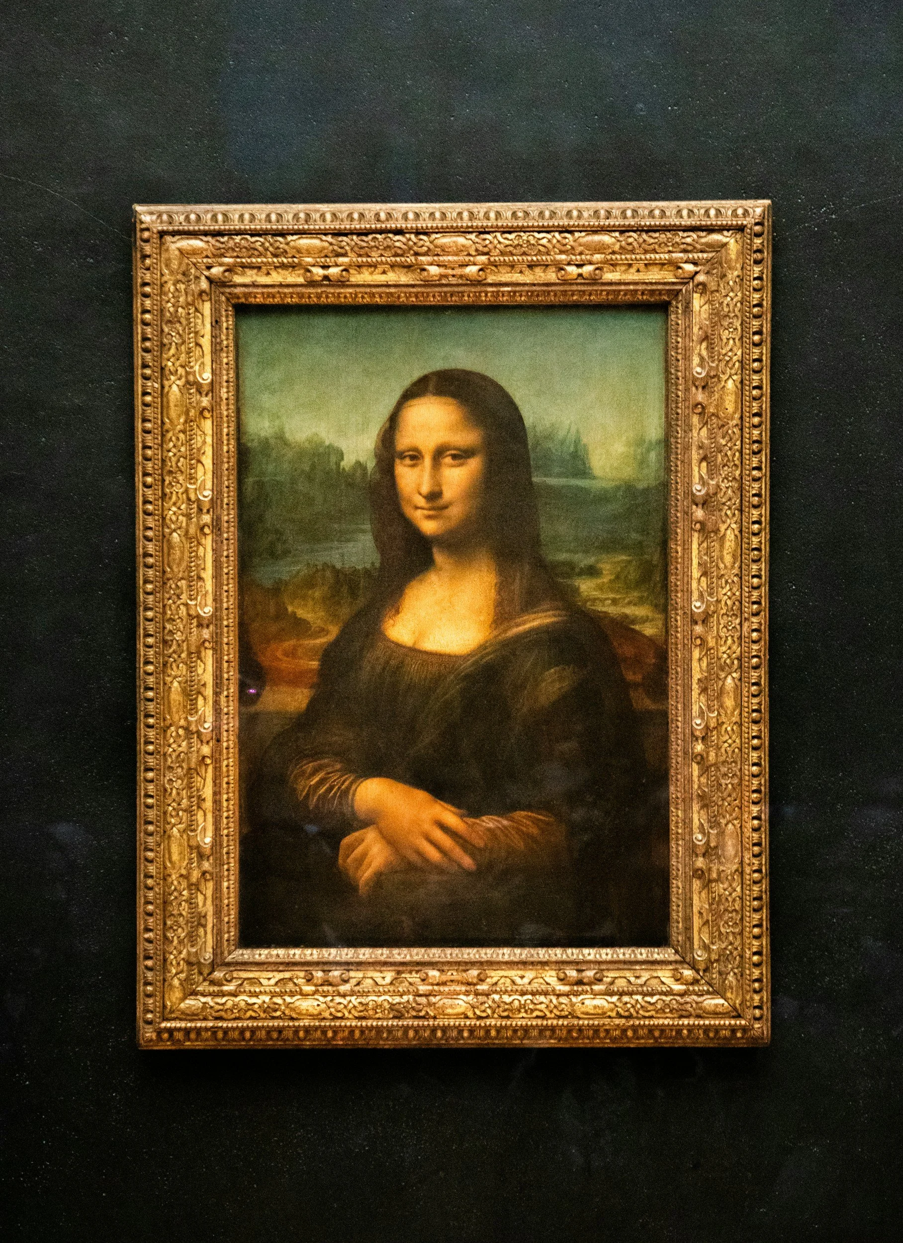
Yikes!
Is she judging me??
The Real Problem: We Don’t Want to Mess Up
Let's talk about that uncomfortable feeling that creeps in when you're surrounded by art. You want to sound intelligent without being pretentious. You don't want to be that person who says ridiculous things just to fill the silence. But mostly? You just want to actually enjoy looking at art instead of performing some weird pantomime of appreciation.
Here's why this matters for your own creative practice: what you notice in others' work directly informs your own. When you start really seeing art instead of just looking at it, you unlock a whole new level of creative understanding. It's like suddenly being able to hear all the instruments in a song you've listened to a hundred times.
Four Things to Look For (That Actually Make Sense)
1. What You Gravitate Toward (And Why)
First things first: trust your gut before your brain kicks in with all its shoulds and supposed-tos.
Walk through a gallery and notice which pieces make you stop. Not the ones you think you're supposed to like—the ones that genuinely make you pause mid-stride. Maybe it's a color that catches your eye. Maybe it's something about the subject matter. Maybe you have absolutely no idea why, and that's totally fine.
Ask yourself: What feeling does this give me? Does it remind me of something? Does it make me want to look closer or step back?
This is about YOU, not about finding the "right" answer. There is no right answer. Your response is valid, period. And here's the cool part: noticing what draws you in helps you understand your own aesthetic preferences, which directly feeds your creative practice.
2. Color, Tone, and Contrast (Or: Why Some Paintings Just POP)
Okay, this is where things got real for me. When I was getting back into art, I stumbled across this friendly, approachable artist named Louise Fletcher who ran an online class called "Find Your Joy." I took it twice (that's how good it was), and one of the biggest lessons that stuck with me was about tone and contrast.
Suddenly, I could see why some of my past paintings felt flat and others absolutely sang.
Here's the deal: Color is about warm versus cool, bold versus subtle—what mood does it create? Tone is about light and dark values—where does your eye go first? Contrast is about high drama versus subtle harmony—how does this affect the energy of the piece?
Let me give you a real example from my own work. In 2020, I did the 100-day project with a wildly ambitious goal: complete 100 four-inch flower paintings. (Spoiler: way too ambitious! But that's a story for another day.) As I painted, I tried my best to match the exact colors of the flowers. Some paintings ended up dull. Some were too much. But some? They absolutely POPPED.
At the time, I couldn't figure out why. Then I took Louise's class.
She taught me about using a limited color palette—mixing everything from one red, one yellow, one blue, plus black and white. This teaches you how colors and tones work together. And here's the kicker: she explained that often people use colors that are all very similar tones. When you squint your eyes at those paintings, everything becomes the same level of darkness or lightness. Not interesting. Your eyes and brain have to work way harder to find the subject.
Try this simple exercise right now: Look at any artwork and squint your eyes. What do you see? If everything becomes a muddy middle tone, there's low contrast. If you can still clearly see distinct areas of light and dark, you've got strong contrast working.
My favorite flower painting from that series? A yellow-orange California poppy against a dark teal background. It JUMPS off the page! The teal is super dark and saturated, while I gradually added white to the yellow to create lighter tones in the petals. That contrast—both in color (complementary colors) and tone (dark versus light)—creates visual excitement.
Once you start noticing this in galleries, you'll see genius artists using tone and contrast to lead your eye around their work in very specific, intentional ways.
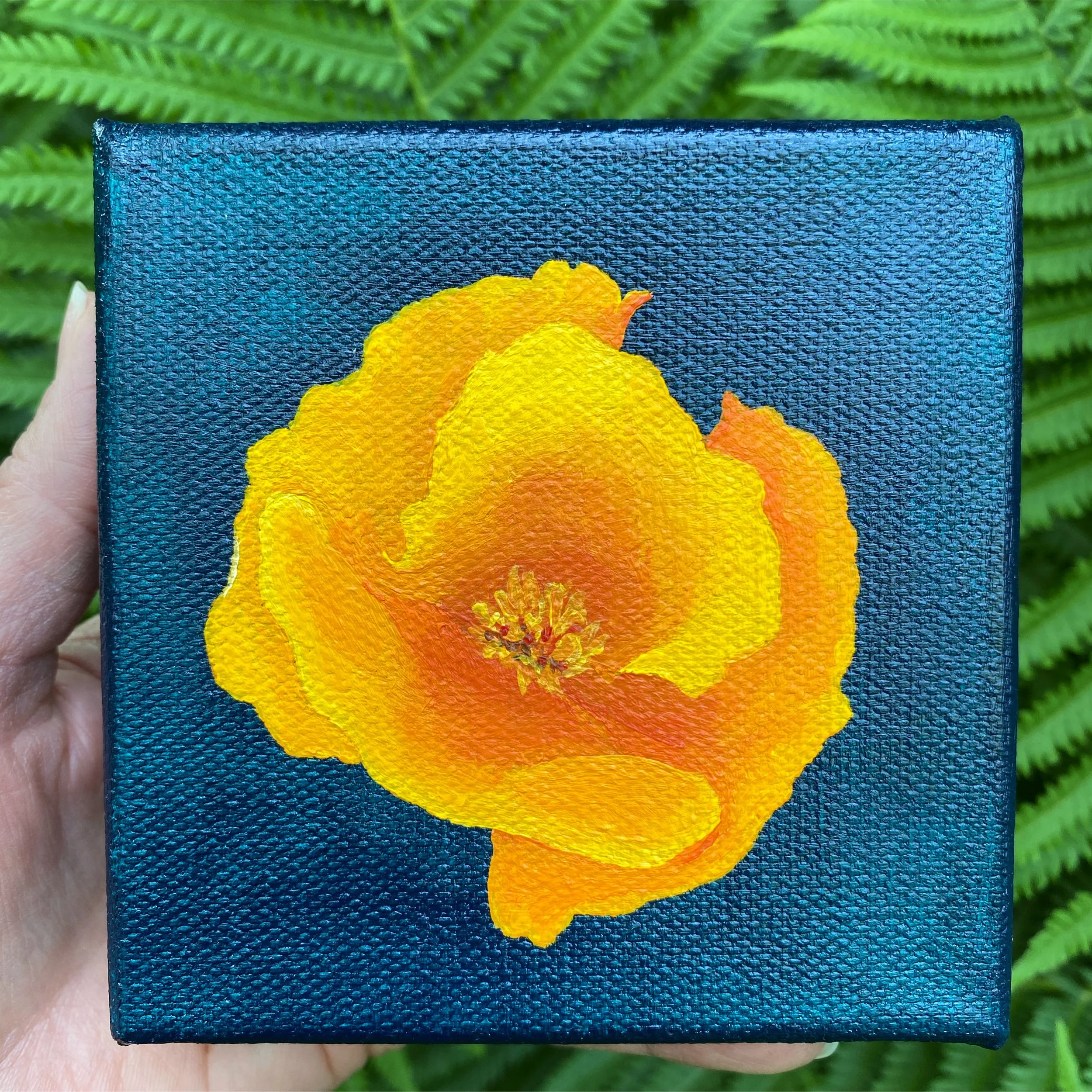
My favorite California poppy…
Where does your eye go first?
3. Composition: The Artist's Road Map
Composition is basically asking: where does your eye enter the piece, and how does it travel through it?
Now, I'll be honest—I find composition a bit more complex than color and tone. It's probably a whole topic for another day. But for now, let's just start noticing it.
Some things to look for: Are features clustered together or spread out? Does the artist use the rule of thirds (placing important elements off-center)? Are there leading lines that guide your eye? What about balance—or intentional imbalance? And here's a big one: negative space. What's not there matters just as much as what is.
This shows up in both 2D and 3D work. When I'm working on my porcelain pieces, I'm constantly thinking about where the eye enters—maybe it's the rim of a bowl, or the placement of a flower drawing on the surface. These aren't just random choices; they're invitations for how you experience the piece.
4. Mood and Intention (AKA: What's the Vibe?)
What feeling or atmosphere does the artist create? Sometimes it's obvious—a stormy seascape feels turbulent, a soft pastel landscape feels peaceful. Sometimes it's mysterious and ambiguous. Both are completely valid.
Pay attention to how technique serves mood. Smooth, precise brushwork creates a different feeling than loose, energetic marks. Heavy texture versus flat surface. Bold versus delicate. The artist is making all these choices to create an experience for you.
And yes, the artist's statement can help you understand their intention, but here's your permission slip: your interpretation is equally valid. Art is a conversation, not a lecture.
Your Gallery Survival Kit
The Permission Slip: You don't have to like everything. You don't have to explain why you don't like something. "It's not for me" is a complete sentence.
The Practice Effect: The more you look at art, the more you see. Just like in your own studio—remember how you couldn't see certain things in your work until suddenly you could? Same deal.
Stealing from Galleries: This sounds scandalous, but I mean it in the best way. Ethically harvest ideas for your own work. Notice techniques, color combinations, compositions that intrigue you. Take mental (or actual) notes. Let what you see inform what you make.
The Social Aspect: Galleries are actually great for casual dates or hanging out with friends. Make it fun! Get coffee after and talk about what you saw. Debate. Disagree. Share your completely subjective opinions.
Quick Tips: Read the artist statement last (form your own opinions first), bring a small notebook if you're a note-taker like me, and go during quiet hours if crowds stress you out.
The Bottom Line
Understanding art isn't about being smart or educated or cultured. It's about being curious and trusting what you see and feel.
You don't need to know about neoclassical Renaissance Impressionistic blah blah blah (yes, I should have paid better attention in my college art history class, but with my rigorous science curriculum, "art-in-the-dark" as we called it was usually nap time). You just need to let your eyes wash over the work. Notice where they go, how they travel, whether the piece pulls you in or makes you wonder.
Notice the color. Notice the tone. Notice the contrast. And yes, notice how you feel looking at the work.
That gives you plenty to talk about without sounding out of your league OR like a stuck-up art critic. And bonus: as you start noticing what you gravitate toward—maybe all your favorites have similar uses of tone or color or energy—you'll naturally start incorporating these elements into your own work.
Pretty cool, right?
So here are your 4 words to remember: Color. Tone. Composition. Mood. That's it. That's your entire toolkit for talking about any piece of art with confidence and genuine insight.
Your Next Steps
Quick Win: Visit a local gallery this week with these four words in mind: Color. Tone. Composition. Mood. Just one gallery. One hour. See what you notice.
Solid Solution: Practice using these four conversation starters next time you're looking at art with friends: "I love the color palette here," "The contrast really draws my eye," "Look at how the composition guides you through it," or "The mood this creates is so interesting."
Treat Yourself: Two fun options if you’re ready to spend a little money: 1. Head to a bigger museum in the city, like the Philadelphia Museum of Art, a bus trip to NYC, or wherever your closest big museum is. Make it a day! 2. Stay local, but go in with the plan to make a purchase! This gives you a different perspective - what painting would I want to look at every day when I walk into the living room? Even if you don’t find “The One,” it’s fun to shop and think about what type of art you’d like to surround yourself with.
Now go forth and enjoy some art!
With Enthusiasm for Life & Art,
Heidi